Cosmos Interaction States
Elevating user experience with clear and consistent component interaction guidelines

Overview
ABOUT COSMOS
Cosmos is a Design System, created for web and mobile, with the intention of looking fresh and simple. It was created to support Letras, the largest song lyrics website and mobile app in Latin America, and Letras Academy, Letras' subproduct and language learning app.
THE REDESIGN
In 2023, we committed to Cosmos and planned to start actually building it. We began the by cataloging our current content, establishing a style library, and then gradually upgrading and organizing it.
THE PROJECT GOAL
We also needed to integrate the component library we already had for Letras Academy. Most of our components had inconsistent interaction states and even missed some very important ones - focused states were rare. I worked on creating guidelines to standardize component interaction states in a way that made them accessible, intuitive, and visually pleasing.
Internal analysis

Hovered
Most of our components had only a hovered state documented, usually darkening the background, border color, and/or text color.

Disabled
Buttons frequently had a disabled state that could reduce opacity or change colors to grays.

Active
Active states could react similarly to hover, darkening it even more. In some cases, it swapped internal elements colors with the background.

Other states
Error states usually had some color change to red.
Pressed and focused states were scarce and only existed on the live website - no documentation.
Lots of states were treated case by case and had little to no pattern of behavior.
External analysis
BASIC PATTERNS
I carefully studied the WCAG accessibility guidelines for interaction states. I also researched articles and looked at open design systems. Some of my takeaways are:
It is not recommended to use only color to convey a state change. The human eye processes color change better when there’s a spatial cue. Other cues, like added elements, are encouraged.
Hovered and pressed states usually darken the element, with the latter being darker. As this state is not available for mobile, it is not recommended to show additional information on hover.
Focused states normally add a colored border around the element. Adding two borders is the ideal for better visibility. It is a commonly neglected state, but required.
Disabled states have almost always low opacity and no saturation. They also have more relaxed WCAG guidelines.
Error states are usually red and always require an error message to inform the user exactly why the error is occurring.
Selected or activated states work better with an added element, like an icon.
STATES INTERSECTIONALITY
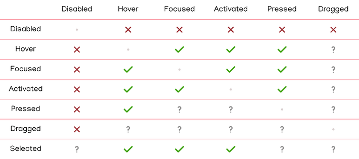
One important inference was the fact that a lot of times one element may need to display more than one state at the same time, and all of them need to be visible and understood. I mapped which states could happen simultaneously so that they could be planned accordingly.

Dealing with Figma's limitations
Figma, the main design tool used in Letras, is not made for such high-fidelity interaction design. To make things easier to document there, I listed all important states and separated them into two main categories:
User states
-
These states indicate the current interaction that the user is having with the component.
-
The user states are: rest, hovered, pressed, and focused.
Response States
-
And these indicate that the component state is an output of a system process.
-
The list of response states is: rest, activated, error, and disabled.
Even though it is not perfect, this should be sufficient as a way of understanding how each component would behave in a larger number of contexts.
The guidelines
REST
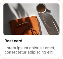
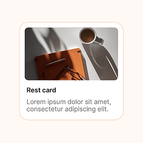
The rest state exists to communicate how the component looks without the interference of user interaction or response states. It is the default state of the component.

User states

HOVERED
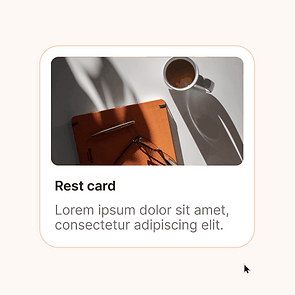
The pattern for the hover state suggests elevation and highlights the component, as if the user were holding it closer.
This is achieved by combining two alterations to the rest state:
-
Darkening the component by changing the background color and/or its border and contents, intensifying its contrast against the background.
-
Increasing the size of the component and its contents, making it look more closely to the screen.

PRESSED
The pressed state should convey the impression of the element being pressed against the background.
This happens by following two alterations to the rest state:
-
Reducing the component's opacity, making it look closer to the background.
-
Decreasing the size of the component and its contents, making it look further away.

FOCUSED
Every interactive component should have a focused state that makes it easily distinguishable from other components.
This is attained by adding two borders around the component, the internal in white and the external in black. The high contrast of the borders makes it visible between them, and the lack of color differs the higher saturation colors used on the website.
Response states

ACTIVATED
The activated state should look like the selected element was marked with a pen or marker among other components of the same kind.
This can be done through some of these alterations:
-
Changing the border or adding one in a bold color, together with bolder or darker text, making it look like it was circled with a pen.
-
Filling the background with an accent color, mimicking something being filled with marker.
-
Adding icons, like a checkmark or a star, to communicate the selection.

ERROR
Error states should communicate a sense of warning and clearly establish the reason for the error
Which is achieved by applying the following alterations to the rest state:
-
Changing the accent color to red, bringing attention to the component
-
Adding a fairly-sized error message.

DISABLED
Disabled components should not draw attention to themselves, looking like they are not clickable. They should only be displayed as a way to communicate that the user can change the state.
This is attained through the following alterations:
-
Removing component saturation.
-
Decreasing opacity to 70%.
Documenting everything
Now, all of this would not be implemented without documentation. At the time we were still evaluating wich plaftorms we would use to document our design system, but I needed a reliable accessible place to put everything in, so I choose Figma. Even though it is far from ideal, it proved itself useful in quickly accessing this guidelines.

I used tables, simple language and several examples and tutorials to make everything easy to use. In this step, I used AI to shorten and clean my descriptions, so it wouldn't be tiresome or confusing.
TOKENS
I talked to our tech teams and gathered feedback about the documentation. We had started to build a token system and it was clear that it was necessary to a quality implementation of these guidelines. With the engineers help, we build up the token system and I included it in the guidelines, complete with a cheat-sheet at the top of it.

Impact
In creating this documentation, I retained the need for meticulous documentation and overcoming design tool limitations. Clear guidelines were established for interaction states, and the project highlighted the significance of thoughtful planning for simultaneous states and maintaining a balance between visual appeal and accessibility. Now new components will be designed and developed with these guidelines in mind.
Faster prototyping and development
Instead of testing new behaviours everytime a new component is created, or looking trough our big library of components to find a good pattern to copy, now designers can follow pre-designed patterns and quickly apply these patterns that are already studied and known to work well.
With the new patterns and token system, developers can leverage the standardized component patterns and their defined states to quickly implement new features. They don't have to waste time custom-coding interactions and states for every new UI element
Consistency across platforms
When element states are defined upfront in a design system, it ensures a consistent, high-quality user experience across the entire product. Making it easier for users to use the product, as they don't have to relearn behaviours, eliminates confusion and frustration from unfamiliarity and builds trust as the product looks more polished and professionaly built.
Improved accessibility
The new guidelines were constructed considering WCAG recommendations and research about best practices to improve accessibility. The visibility of the system status is an important acessibility concern, communicating with the user what is happening and what the user can do. The guidelines ensures no important states will be forgotten, making the product more understandable, easier to use and acommodating different users needs.
Smoother more appealing UI
The patterns were created considering contemporary market visuals and upcoming UI trends. They also consider familiarity with other products and simulate interactions that happen in the real world. That combined with smooth animations and consistent behaviour increase the percieved visual appeal.
